|
Petra: I like reptiles Lilli: I like my bed
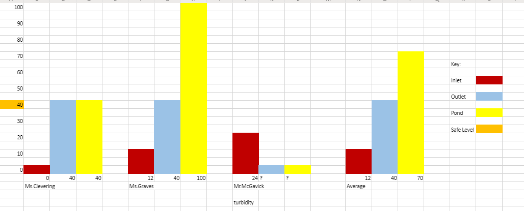 How We Did This: This bar graph shows the Turbidity from all three fifth grade classes. We found the Turbidity from the inlet, outlet, and pond. Then, we found the average Turbidity in each area. Once that was done, we were able to determine where the fastest and slowest water is. These are our plots These were the plants in This was the wetland in 2016/ which make it easier to around April of 2019. 2017 (when the project tell if plants are growing. started). Challenges The challenges we faced were mostly because of the data. One class didn't write in most of their data. And on all the three charts the handwriting was hard to read because of the pencils. If we were to do things differently, I would say, use different pencils and finish all the data. Otherwise it wasn't too complicated, though figuring out how to use excel was a bit hard. We finished within a week, though Petra should take most of the credit for the bar graph and averaging the data. We didn't have too many issues. That being said, we faced our problems head on and it paid off. Water Movement
The fastest moving water is in the pond, the pond also has the most Turbidity. There is a reason why, Turbidity in a nutshell is the cloudiness of the water. The place with the fastest water is the place where the most under water stuff is going to be disturbed. Ex: If you pour water on to submerged rocks they will shift.
0 Comments
Leave a Reply. |
Authors:
|

 RSS Feed